 Tweet
Tweet
Carpe, on the subject of media bias, here is a chart I think is worth talking about that I found the other day when I was looking for the link to the interview/book for you with that Harvard professor on media bias.
This chart is by the MediaBiasFactCheck people, and is a 2018 version (they have a slightly newer version but IMO it's not as clear in its groupings and a bit more confusing, so I'm going to use this one, which is the one I first came across):
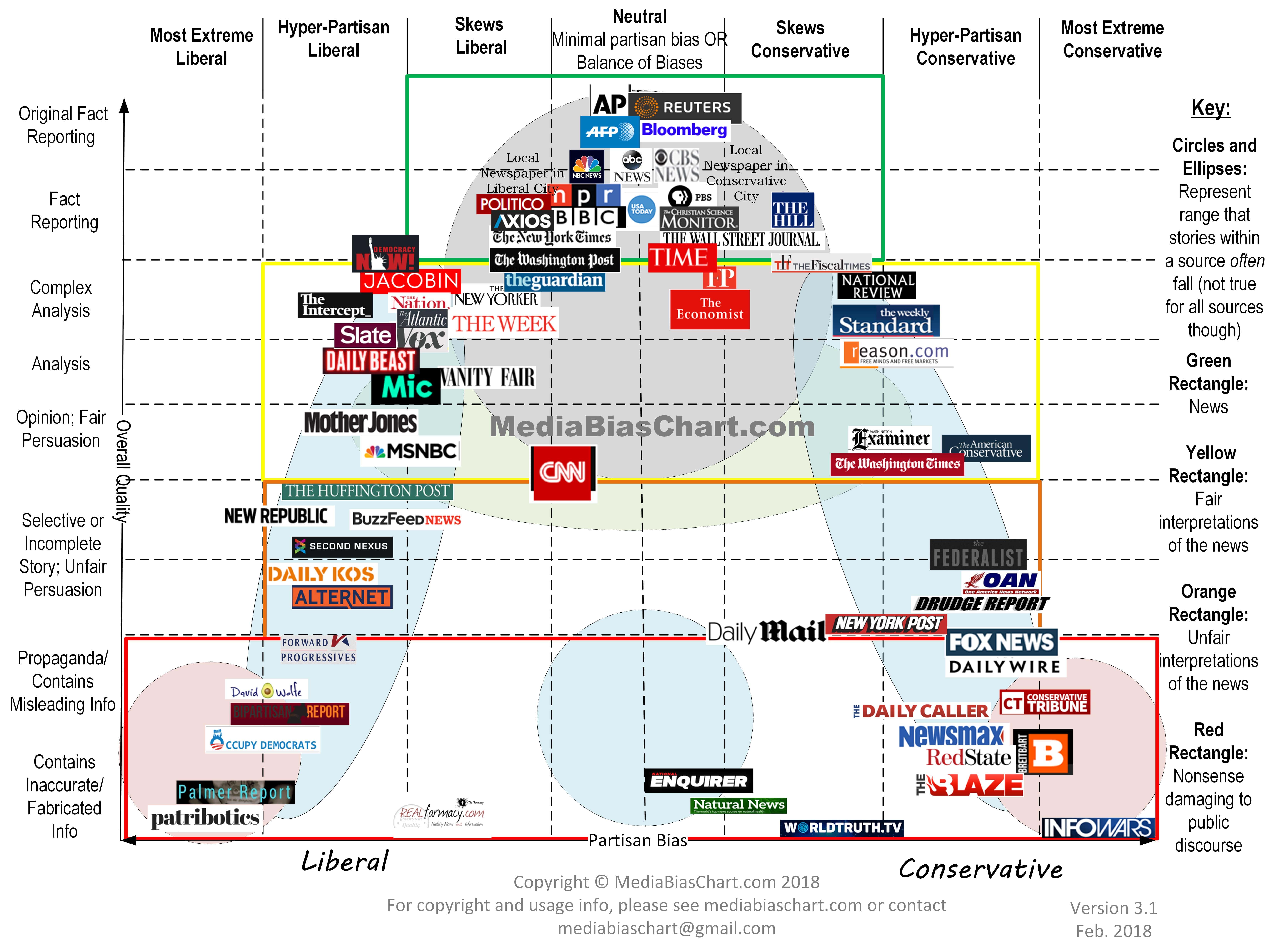
Firstly, consider that bottom red rectangle containing the garbage and fake news outlets. I'll note that despite being a liberal I have never ever heard of, seen, or ever seen anyone link to anything in that bottom-left-hand corner. Those sites are so obscure and so unfrequented that I have to think the person who compiled the image was really, really, going out of their way to try and find some sort of fake news sites on the left, no matter how obscure and unvisited. Whereas the bottom right-hand corner of garbage sites is linked to regularly by people on this website, and those sites and sources command a large audience in general. That points immediately to quite a significant asymmetry between left and right - despite the picture creator's best efforts to paint the left and right wing as both having garbage sources that sit in that bottom red rectangle, in actual fact the left really doesn't make use of garbage sources whereas the right makes very heavy use of garbage sources and sites.
A second thing that caught my interest was the row that says "complex analysis" and to a lesser extent "analysis". I think this is actually the most important type of news outlet. It's all very well to be able to report an event "Today X did Y", but unless you have some wider explanation within which to understand the event occurring the event itself can be relatively meaningless. So what you want are really informed writers who are about to talk about the history of X and Y, and about whether the event implies Z, and how the event was influenced by A, B, and C, and explain that what next needs to happen is question D needs answering etc. This is especially true in the age of modern politics when a purely factual news outlet will report "Republicans said X, Democrats said Y" and then move onto the next topic... which is depressingly like a football game in which the commentator says "Team A said they won, Team B said they won, who can really know what the score is?" The whole point of the sports-commentator / news-reporter's job is to tell you what the objective facts actually are, and explain how they are relevant to the situation, quite aside from what each side says. But when you look at that chart's "complex analysis" category, the left and the right wing are not remotely equal. The left hand side is jam-packed with popular and well-known outlets so clearly people on the left are really really interested in subscribing to, buying, and reading, complex high quality analysis. Whereas on the right hand side of that category, the tumbleweeds are basically rolling. There's the Weekly Standard which closed down last year due to lack of readership, and the National Enquirer which is basically a vanity publication with few actual readers. On the edges of that category are the Fiscal Times and Reason.com neither of which I have ever heard of despite being an avid consumer of a huge variety of news resources so both must be pretty tiny. And that's pretty much it. So the right has almost no media sources which actually do serious analysis and which are actually popular. Instead the right loves their absolute garbage outlets that are in the bottom righthand corner of the diagram. The average left-wing reader is opting for "complex analysis" sites when they're not reading the "fact reporting" category of the top-middle while the average right-wing reader is opting for "contains inacccurate/fabricated info, damaging to public discourse" sites.
This chart is by the MediaBiasFactCheck people, and is a 2018 version (they have a slightly newer version but IMO it's not as clear in its groupings and a bit more confusing, so I'm going to use this one, which is the one I first came across):
Firstly, consider that bottom red rectangle containing the garbage and fake news outlets. I'll note that despite being a liberal I have never ever heard of, seen, or ever seen anyone link to anything in that bottom-left-hand corner. Those sites are so obscure and so unfrequented that I have to think the person who compiled the image was really, really, going out of their way to try and find some sort of fake news sites on the left, no matter how obscure and unvisited. Whereas the bottom right-hand corner of garbage sites is linked to regularly by people on this website, and those sites and sources command a large audience in general. That points immediately to quite a significant asymmetry between left and right - despite the picture creator's best efforts to paint the left and right wing as both having garbage sources that sit in that bottom red rectangle, in actual fact the left really doesn't make use of garbage sources whereas the right makes very heavy use of garbage sources and sites.
A second thing that caught my interest was the row that says "complex analysis" and to a lesser extent "analysis". I think this is actually the most important type of news outlet. It's all very well to be able to report an event "Today X did Y", but unless you have some wider explanation within which to understand the event occurring the event itself can be relatively meaningless. So what you want are really informed writers who are about to talk about the history of X and Y, and about whether the event implies Z, and how the event was influenced by A, B, and C, and explain that what next needs to happen is question D needs answering etc. This is especially true in the age of modern politics when a purely factual news outlet will report "Republicans said X, Democrats said Y" and then move onto the next topic... which is depressingly like a football game in which the commentator says "Team A said they won, Team B said they won, who can really know what the score is?" The whole point of the sports-commentator / news-reporter's job is to tell you what the objective facts actually are, and explain how they are relevant to the situation, quite aside from what each side says. But when you look at that chart's "complex analysis" category, the left and the right wing are not remotely equal. The left hand side is jam-packed with popular and well-known outlets so clearly people on the left are really really interested in subscribing to, buying, and reading, complex high quality analysis. Whereas on the right hand side of that category, the tumbleweeds are basically rolling. There's the Weekly Standard which closed down last year due to lack of readership, and the National Enquirer which is basically a vanity publication with few actual readers. On the edges of that category are the Fiscal Times and Reason.com neither of which I have ever heard of despite being an avid consumer of a huge variety of news resources so both must be pretty tiny. And that's pretty much it. So the right has almost no media sources which actually do serious analysis and which are actually popular. Instead the right loves their absolute garbage outlets that are in the bottom righthand corner of the diagram. The average left-wing reader is opting for "complex analysis" sites when they're not reading the "fact reporting" category of the top-middle while the average right-wing reader is opting for "contains inacccurate/fabricated info, damaging to public discourse" sites.


Comment