 Tweet
Tweet
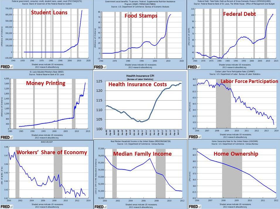
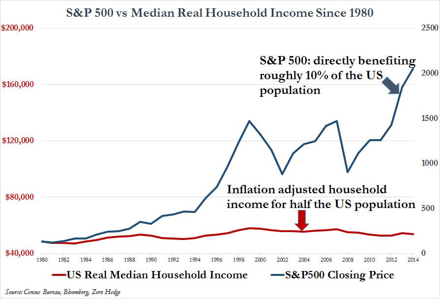
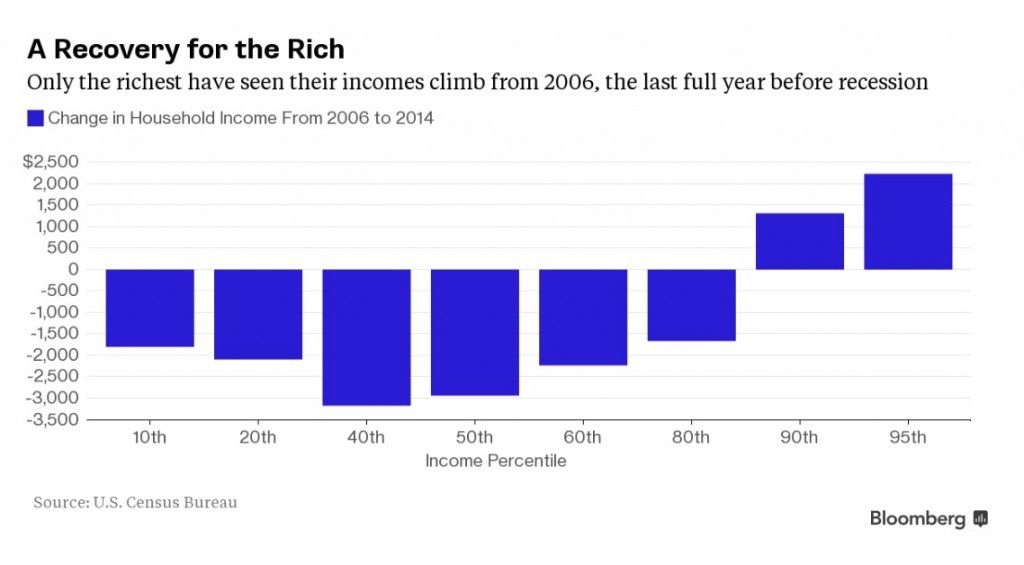
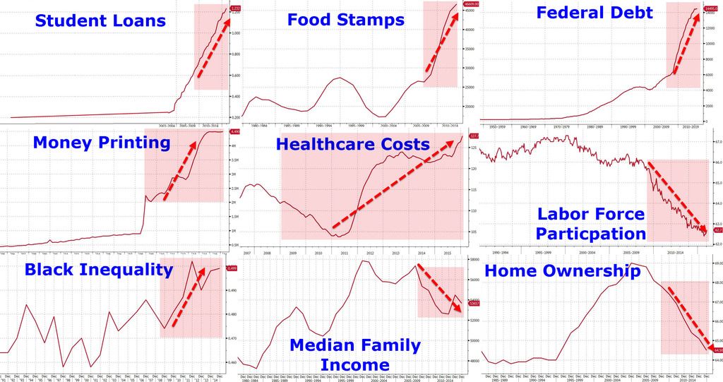
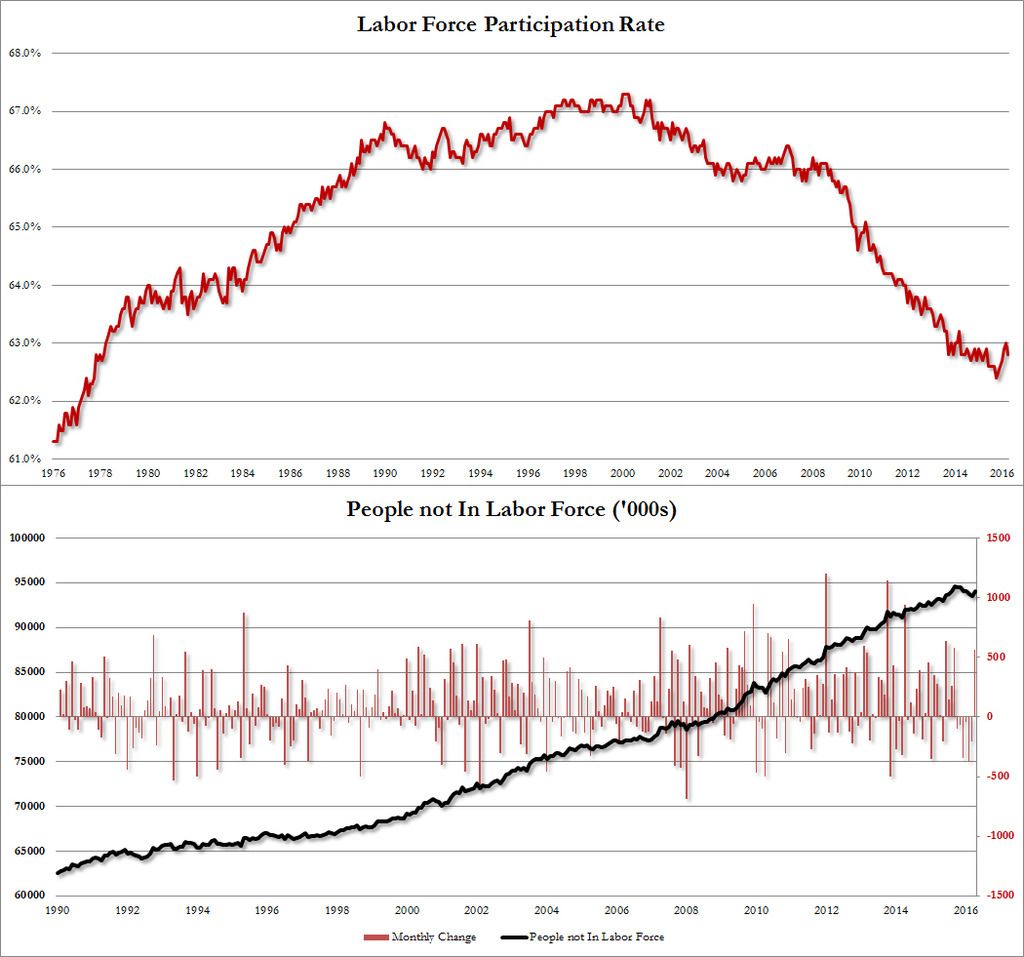
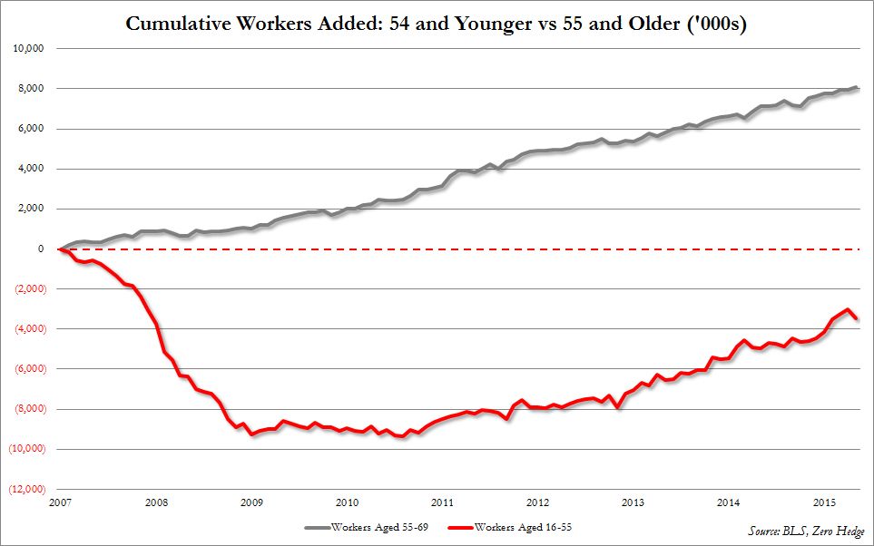
US "recovery" in a visual nutshell:
You be the judge.
You be the judge.
 No matter what perspective, using the same start and end points would allow an accurate comparison of the data.

| Topics | Statistics | Last Post | ||
|---|---|---|---|---|
|
150 responses
1,171 views
1 like
|
by seanD
04-10-2024, 03:12 PM
|
Comment